Tuesday

▼ Hexagons / Octagons / Triangles ▲

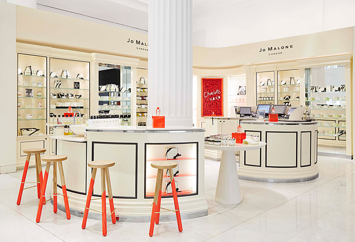
The Cellular trend, which features interlocking geometric shapes, creates new dynamism for office environments, as seen at NeoCon...
The Cellular trend was popular at NeoCon.
L-to-R clockwise: Arcadia, Foliar by Adam Cornish, ICF, Shaw Contract, Mannington and Six Inch
…while in furniture, adds new dimension, as seen at the International Contemporary Furniture Fair.
The cellular trend was big at ICFF. Tom Dixon (left) and Jonathan Adler (right)
Any shape can be repeated and used in groupings to create a cellular feel.
Q5 by Davis demonstrates the cellular trend. Q5 by Davis
The new cellular structures work particularly well when paired with another big commercial trend seen at NeoCon, Angular:
The angular trend was hot at NeoCon. Haworth

The immersive environment of Meltino Bar and Lounge


A Portugal architecture and lighting design firm (Braga, Portugal),  gives new meaning to “screened-in” with this immersive space designed for the Braga Parque Shopping Mall (Braga, Portugal). The environment houses Meltino Bar and Lounge and is enclosed by a white screen adorned with stylized cut-outs of coffee beans, allowing some light to infiltrate the space. The screen isn’t just for looks, however – it was created, in part, to identify the brand, owned by Lanhoso-torrefacção Cafés Lda. (Braga, Portugal), a coffee distribution company, as a retreat from the shopping mall’s hustle and bustle. In addition to fabricating a uniquely engaging environment, the firm strove to reinforce the coffee brand’s modern identity.


Wednesday

PARKROYAL Hotel, Singapore

PARKROYAL Hotel Singapore PARKROYAL Hotel, Singapore

Advocates of the “Green City” concept, the creative team at WOHA developed a hotel design with a surreal appearance. PARKROYAL on Pickering is a highly modern architecture project in Singapore, combining concrete organic shapes with simple rectangular volumes and incredible sky-gardens. Greenery flourishes at every four levels of the hotel, visually blending the massive accommodation unit with the neighboring park.

PARKROYAL Hotel Singapore 01 PARKROYAL Hotel, Singapore

PARKROYAL Hotel Singapore 02 PARKROYAL Hotel, Singapore

PARKROYAL Hotel Singapore 03 PARKROYAL Hotel, Singapore

PARKROYAL Hotel Singapore 04 PARKROYAL Hotel, Singapore

PARKROYAL Hotel Singapore 05 PARKROYAL Hotel, Singapore

PARKROYAL Hotel Singapore 06 PARKROYAL Hotel, Singapore

PARKROYAL Hotel Singapore 07 PARKROYAL Hotel, Singapore

PARKROYAL Hotel Singapore 08 PARKROYAL Hotel, Singapore

PARKROYAL Hotel Singapore 09 PARKROYAL Hotel, Singapore

PARKROYAL Hotel Singapore 11 PARKROYAL Hotel, Singapore

PARKROYAL Hotel Singapore 12 PARKROYAL Hotel, Singapore

PARKROYAL Hotel Singapore 13 PARKROYAL Hotel, Singapore

PARKROYAL Hotel Singapore 14 PARKROYAL Hotel, Singapore

PARKROYAL Hotel Singapore 15 PARKROYAL Hotel, Singapore

PARKROYAL Hotel Singapore 16 PARKROYAL Hotel, Singapore

PARKROYAL Hotel Singapore 17 PARKROYAL Hotel, Singapore

PARKROYAL Hotel Singapore 18 PARKROYAL Hotel, Singapore

PARKROYAL Hotel Singapore 19 PARKROYAL Hotel, Singapore

PARKROYAL Hotel Singapore 20 PARKROYAL Hotel, Singapore

Thursday

Charlotte’s Corner at Jo Malone

Those of you who think you know Jo Malone, think again. London Style Editor Charlotte Stockdale has put her own stamp on the brand this spring inspired by “her love of the unexpected."  For the Jo Malone brand this means a departure for the signature cream and black in favor for a clash of neon, something Stockdale calls “fashion graffiti.”  In addition to a one-of-a-kind installation of Jo Malone products combined with vintage finds and textiles at Selfridges, the Red Roses fragrance has been given a makeover (see below). Only 300 of these limited edition bottles are available in store now on sale alongside everything from perfume bottles to antique fragrance and candle accessories – and as if this isn't enough, Charlotte’s collaboration with homeware brand Abigail*Ryan offering bold cushions and accessories. Time to pop to the shops…
  
jo-malone-charlottes-corner

jo-malone-charlottes-corner2

The star of the show and Charlotte’s favorite Jo Malone fragrance, Red Roses, has been transformed from mere perfume into a collectable objet d’art – three hundred limited edition cologne bottles have been hand-dipped in neon paint and individually numbered.


jo-malone-red-roses-textiles

Of the designs, Charlotte Stockdale said:
“I wanted to add a modern twist to the iconic packaging of Jo Malone London.  I love neon, especially on a neutral background, so the classic cream and black set against shocking pink is a brilliant combination.  It’s fashion graffiti.  Playful, cool and alive.”
 

Monday

BULLSEYE

Targeting the Cities

The new CityTarget concept is more than just a smaller superstore; it’s strategically crafted for the urban guest.  Target Corp. (Minneapolis) has always won high marks in the store design world for its ability to brand itself through its stores.